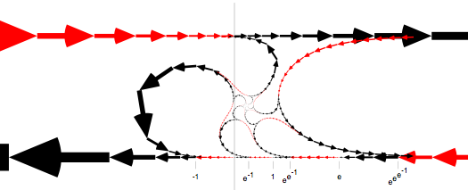
This picture in pdf
was made with pdfgen, an open-source Python library from
ReportLab.
I found pdfgen very straightforward and easy to get started with.

The program starts with a set of complex points--in Python:
[pi * 1j + sinh( n / 3.0 ) for n in range(-16, 17)]These points range from about -100 + pi i to +100 + pi i, and are the end points of the set of arrows that cross the top of the graph. (Most of the points are off the sides of the picture).
The top line of arrows is plotted. Then, the points are taken in two directions: the arrows on the real axis (at the bottom) result from repeatedly mapping the set of points through the exp() function and then plotting. Each arrow is the same color as the corresponding one in the original set.
Then, the original point set is repeatedly mapped through the complex log() function and plotted, resulting in the curved paths.
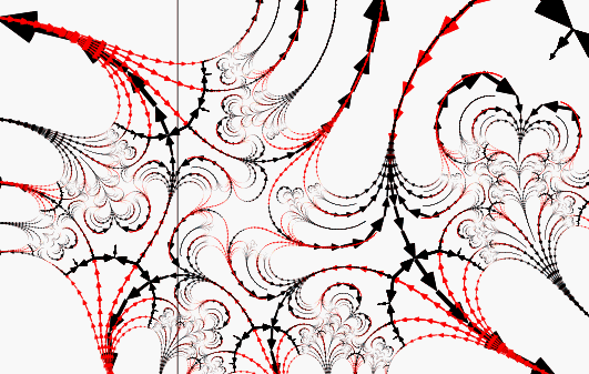
The nice thing-- well, just one of the nice things-- about pdf is that you can produce pictures with details that can be zoomed in on. Here's a zoom of the center section of the picture:
Here's a
version where not only the conventional log is done, but also a few of its
echoes and reflections around multiples of 2pi i. Also, the original
point set is taken a bit further out on the number line.

Click the picture for a bigger version. It's .gif because the .pdf
is a 7 megabyte monster.
Here's the Python source for the simple picture, the baroque picture, and arrows. (The latter uses a couple getter functions that aren't in the unmodified pdfgen library, but I left hints for making it stand alone).